Data Analyst | Sept - Dec 2024
An Interactive Tableau Dashboard of Healthcare Marketing Campaigns for Row Health
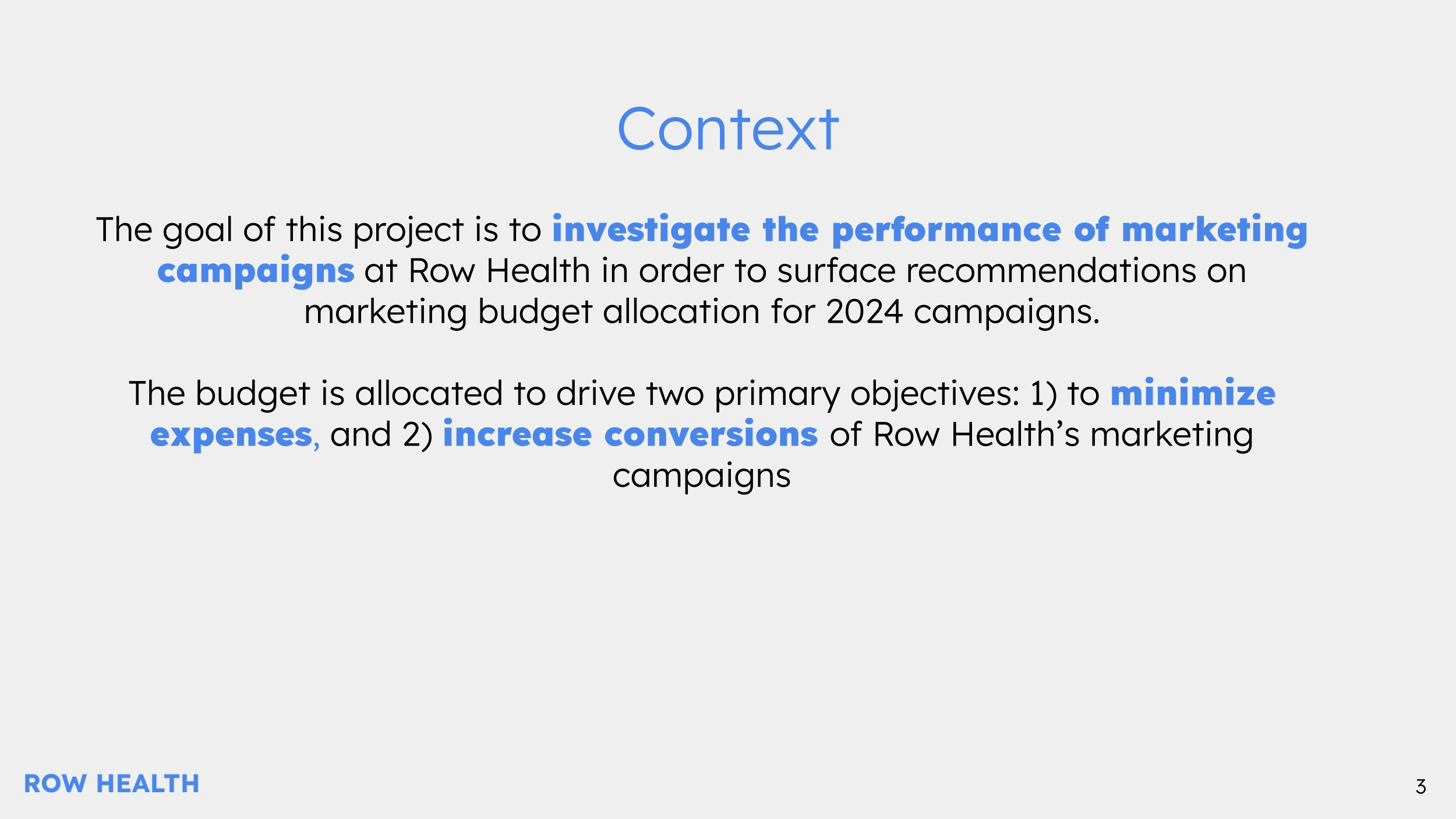
The goal of this project is to investigate the performance of marketing campaigns at Row Health in order to surface recommendations on marketing budget allocation for 2025 campaigns.
My Role:
Create an Interactive Tableau Dashboard for cross-functional stakeholders to explore Marketing Campaign Insights
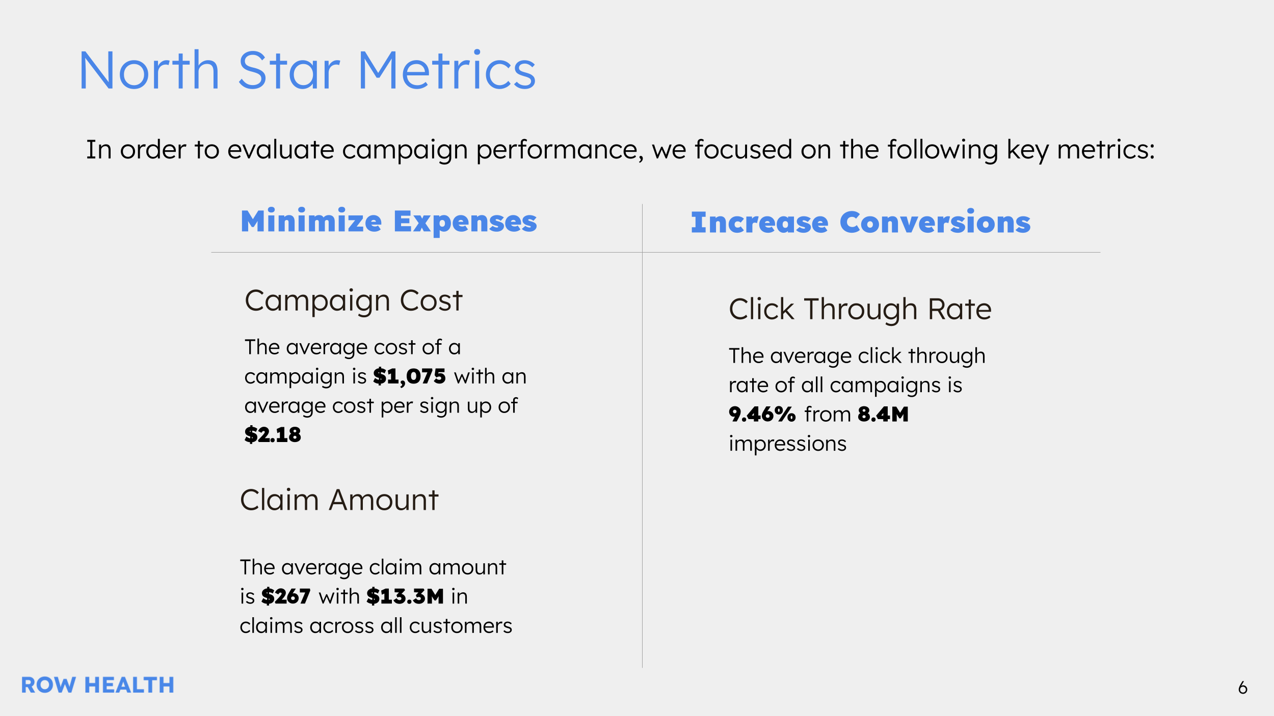
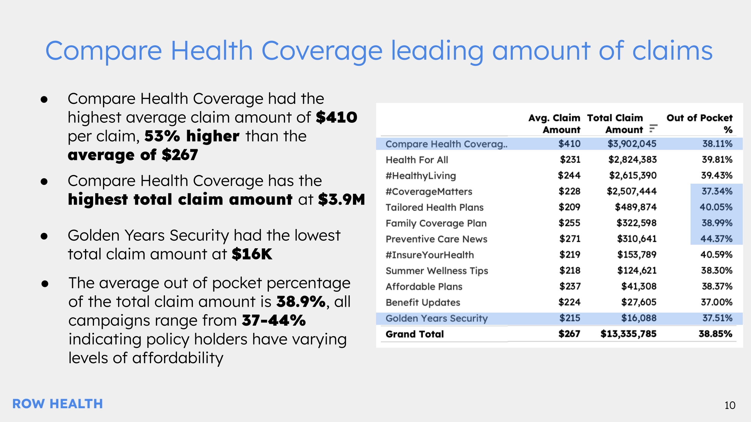
Evaluate Campaign Performance by calculating Campaign Cost, Claim Amounts, and Click-Through-Rate
Present key recommendations and findings to help drive decisions for next years campaign budget
Process:
Meeting with stakeholder to clarify the key metric definitions, dimensions, and timelines
Create a template that would show the stakeholder what the dashboard will look like
Iterate and tweak dashboard to meet formatting and visualization preferences
Functionality:
Users have access to filter by Plan, State, and Campaign Type
Horizontally split by the marketing metrics, signup metrics, and customer claims metrics
Contains a mix of tables and visualizations to capture specific figures and broader trends over years
Key Recommendations
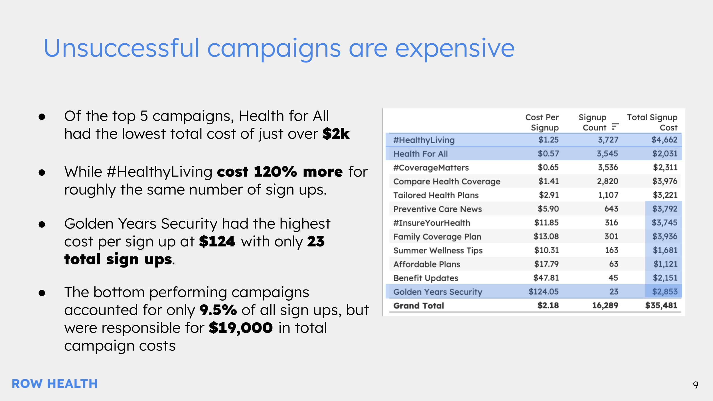
Bottom 7 Campaigns: Reallocate $19k from lower-performing campaigns to high-converting ones like Health for All, #CoverageMatters, and #HealthyLiving to maximize growth.
Health for All: Retarget 40K users who clicked but didn’t sign up; an estimated 1,200 new customers could result at a 3% conversion rate.
#HealthyLiving: Optimize #HealthyLiving by focusing on engaged audiences, increasing conversion rates from 9.6% to 15-25%.
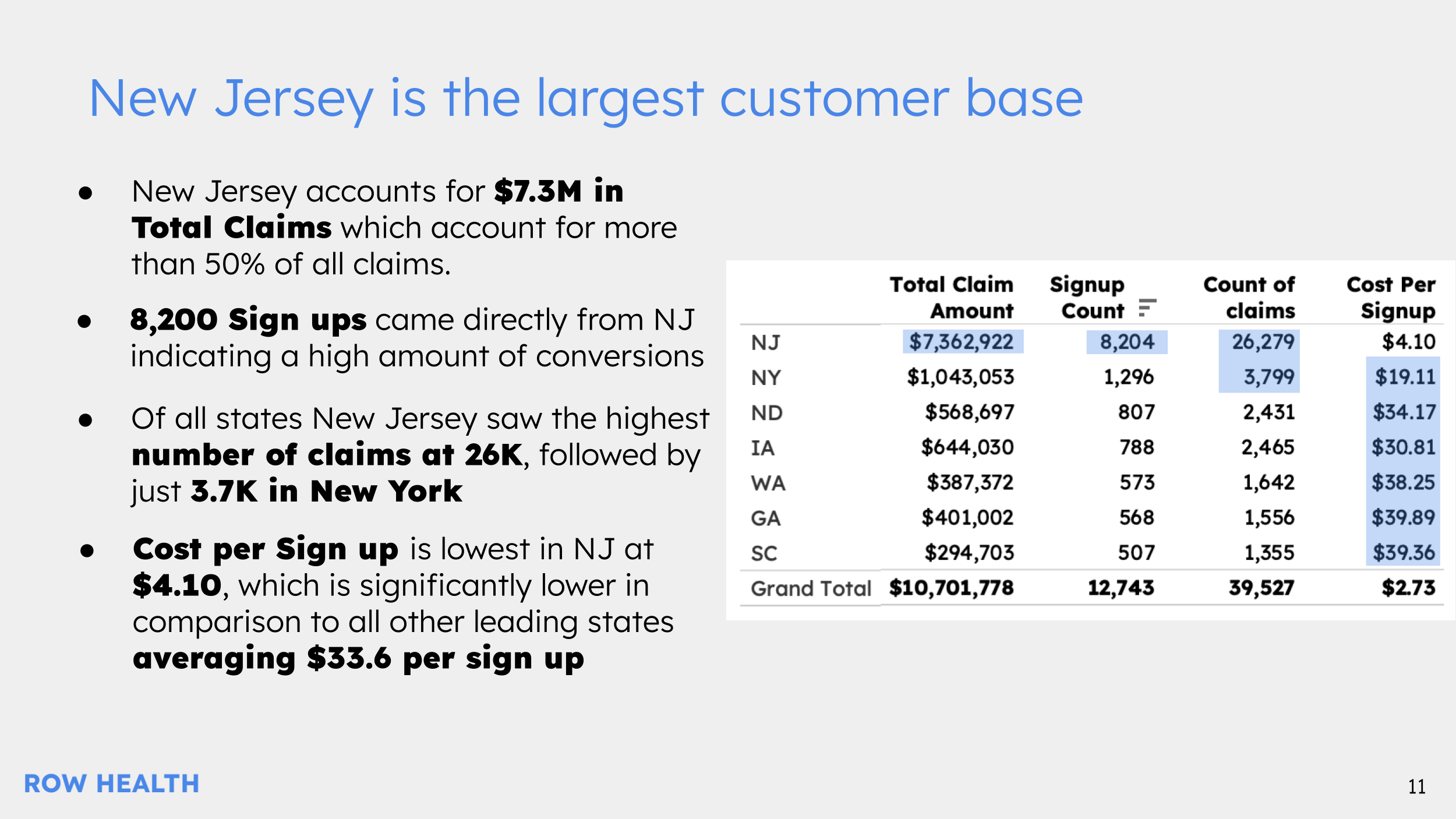
Campaigns by State: Pause campaigns in states with fewer than 100 signups and redirect budget to target New Jersey, New York, Iowa, and North Dakota for better ROI.
Dashboard
This interactive dashboard is made for internal teams to explore the marketing campaign metrics. Users can narrow in on the desired Plan, State, and Campaign Types to see changes in north star metrics and campaign performance.

Presentation
This presentation is made to highlight specific figures in the data and provide recommendations to stakeholders. Deep diving into campaign performance, north star metrics, and uncovering trends from the dataset. The full presentation can be viewed here.